Most resalers have at least one, if not more, glass showcases in their shops. Showcases are great because they, well because
they showcase merchandise.
But if you’re just using your cases as, basically, neat storage, you’re not making the dollars per square foot you could. Here’s some examples to get you thinking.
First up, the importance of DEPTH and DIRECTION are all-important. As the owner of the following graphic says,
Depth and Dimension: customers’ eyes struggle to see individual pieces that are placed on the same plane. Use risers and/or displays with different heights, giving your customers’ eyes a place to start and an inviting roadmap from piece to piece.

Source: riogrande.com via Marijana on Pinterest
.
You don’t have to invest in a lot of expensive and bulky props to make your showcase look good. Here’s an example. Change out the blue chips with river rocks, dried beans, even brown rice, to highlight a different grouping of goods. And remember, what you’re showing doesn’t have to be jewelry: any small treasures will look great in a showcase.
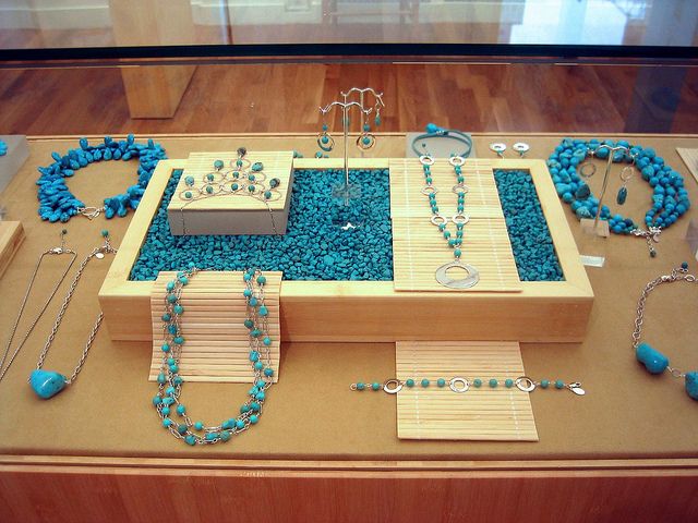
Source: flickr.com via Karin on Pinterest
.
.
.
Driftwood, a scattering of polished stones, and some slightly-shiny fabric may be all you need.

Source: images.search.yahoo.com via Think on Pinterest
.
.
.
Creating interest can be as simple as using subtly-patterned paper and covering a few boxes to become risers. Here, it’s 3 coordinated papers, and merchandise to match. Note the asymmetrical placement of everything from the necklace busts to the little risers.

Source: flickr.com via Ola on Pinterest
.
Read more at Are your showcases boring them to death?
.


